How we created the Sidedoor Studio brand.
Bo Brindle
January 20, 2026
Since September I’ve been working at Side Door Studio, helping define the brand from strategy and visuals to building the website from nothing.
This is my first ever time building a full site. I don’t really enjoy it, but it’s really good to learn. Thanks to my brother Joe Brindle , who taught me a lot.
The main thing I’ve loved is working on something I really care about. When you’ve helped build the brand alongside Si Beales and Alex Moran (absolute legends), you know it inside out and care about every detail. The week-after-week collaboration has been the best part.
Now I’m going to get into some of the reasons behind the branding, for all the branding nerds out there.We knew it had to feel:-personal-bespoke-and completely disrupt standard L&D branding-No cookie-cutter visuals.-No generic sans-serif logos.-No corporate illustrations.
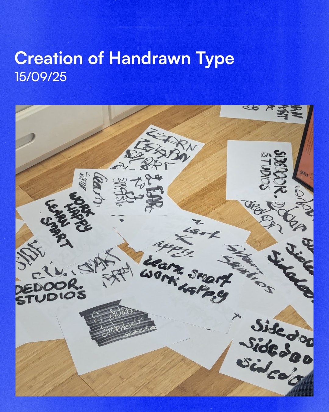
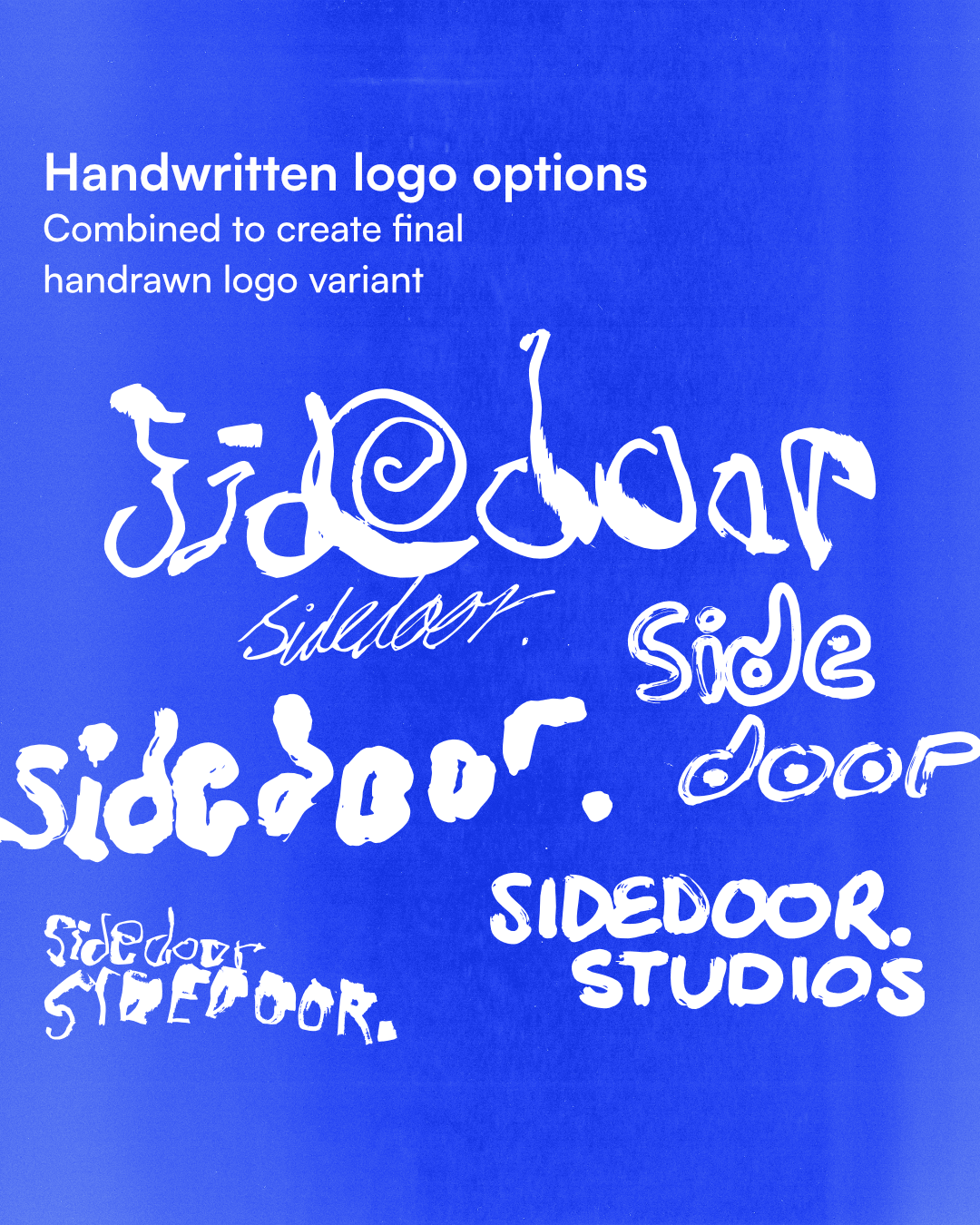
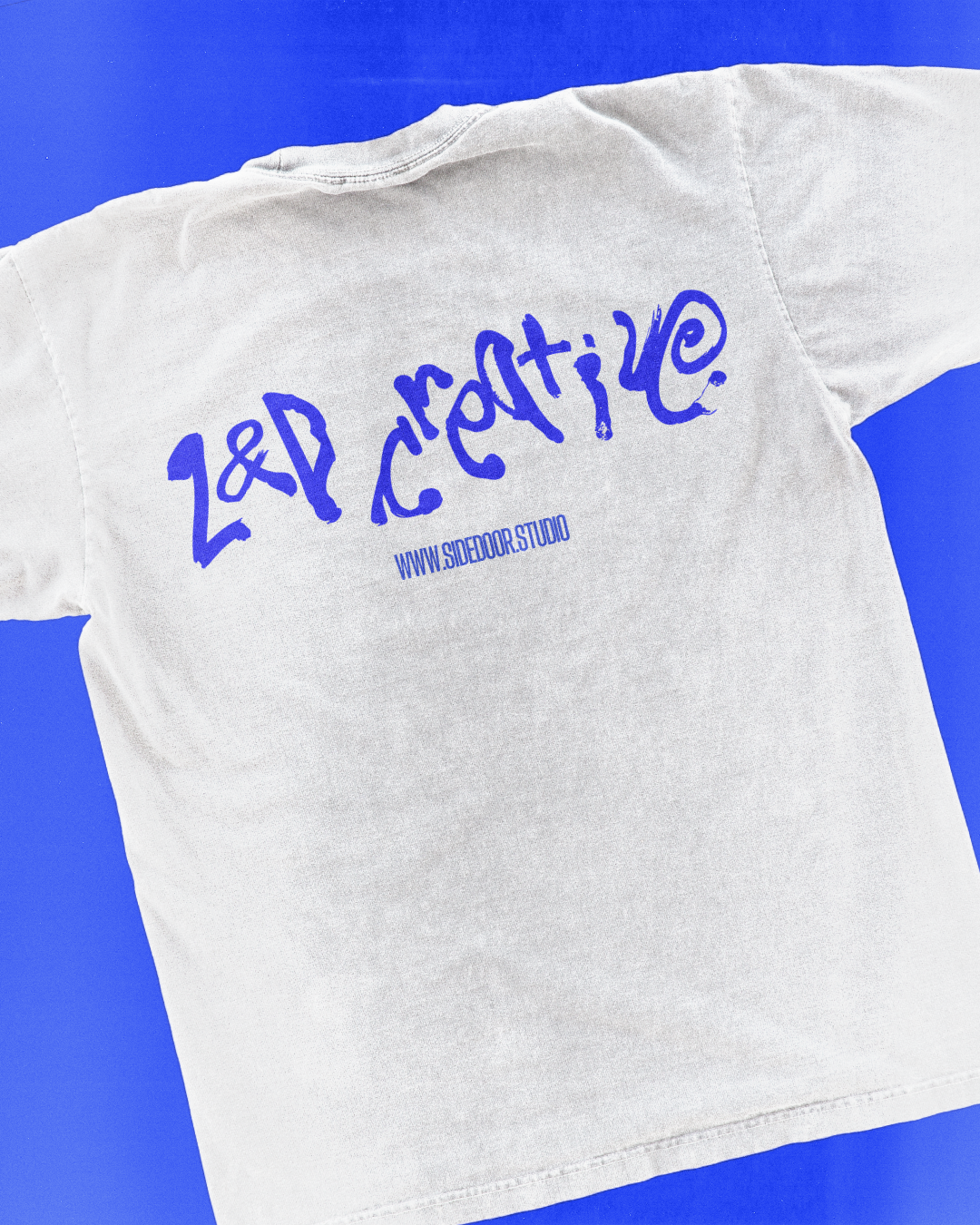
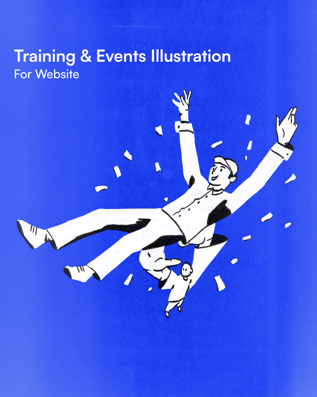
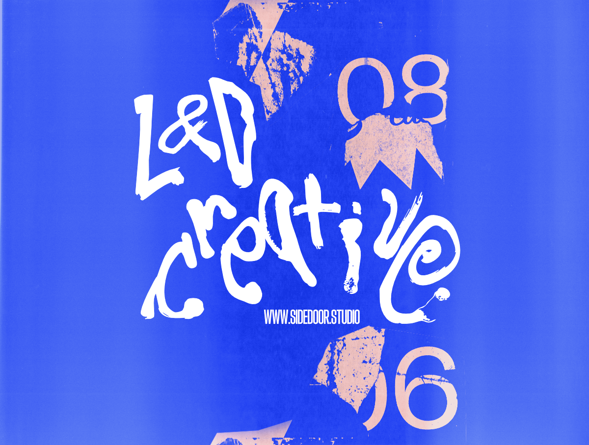
That’s why we went hand-drawn:-handwritten type-jittery motion-expressive, imperfect visuals.
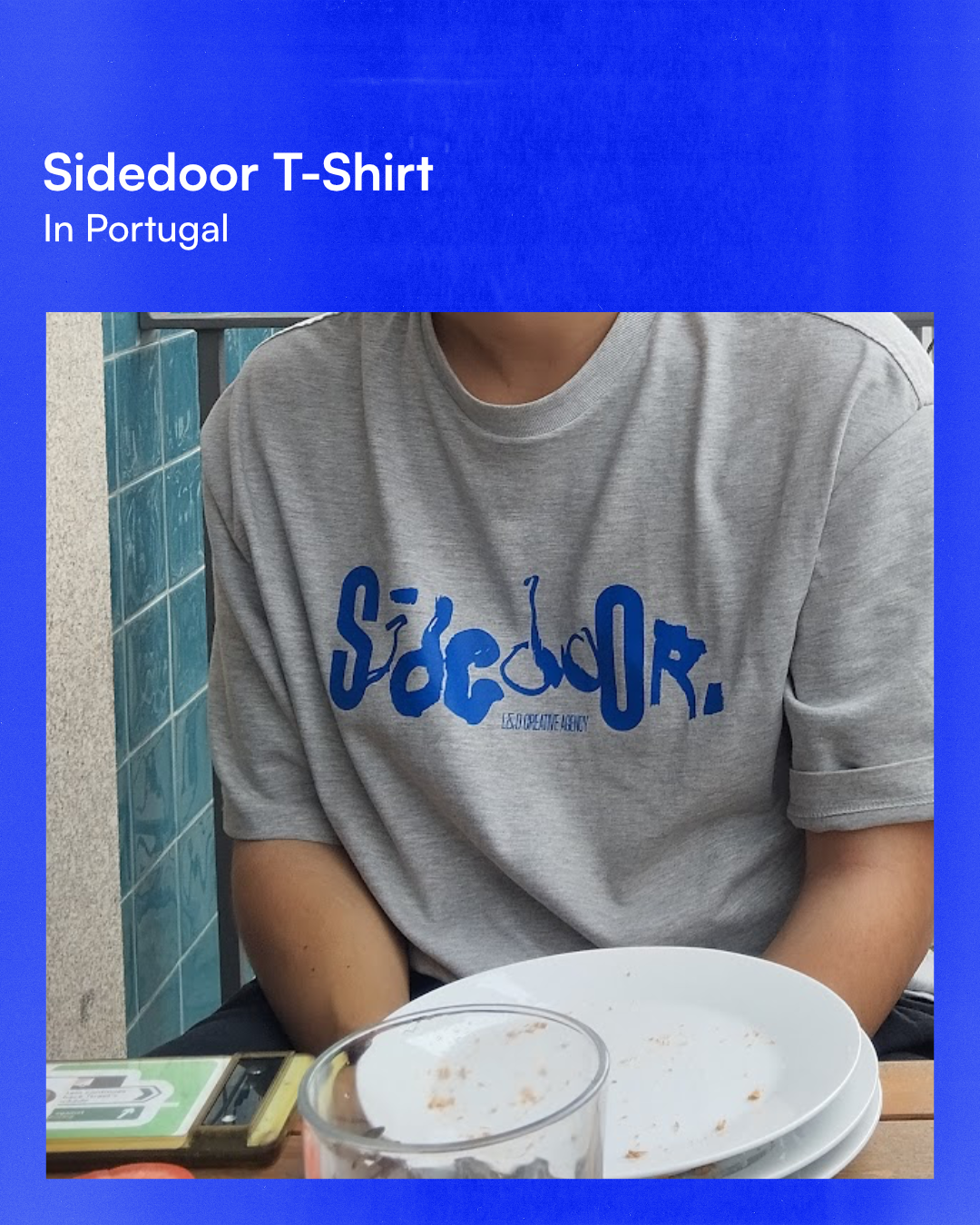
You can see it across:-the website-the showreel-the T-shirts-and that motion graphic where the logo warps into the hand-drawn lettering
It feels human, made by humans.
We also wanted it to feel bold and unafraid, so we leaned into:-messy illustrations with exaggerated perspectives-layered textures-collage elements
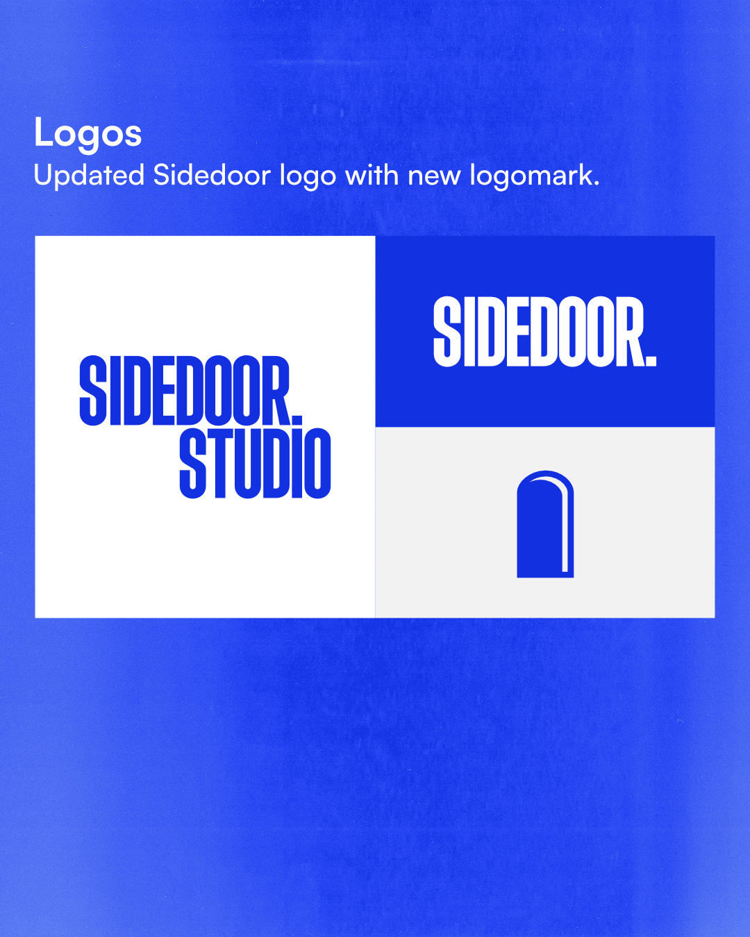
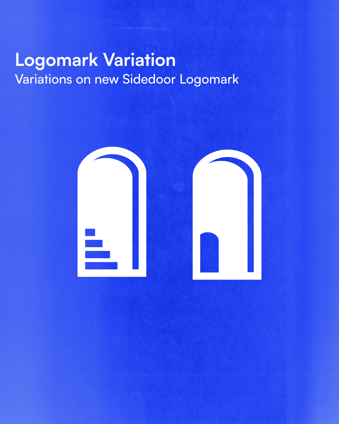
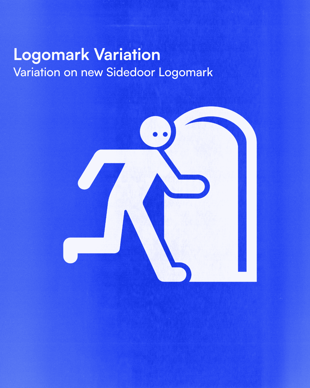
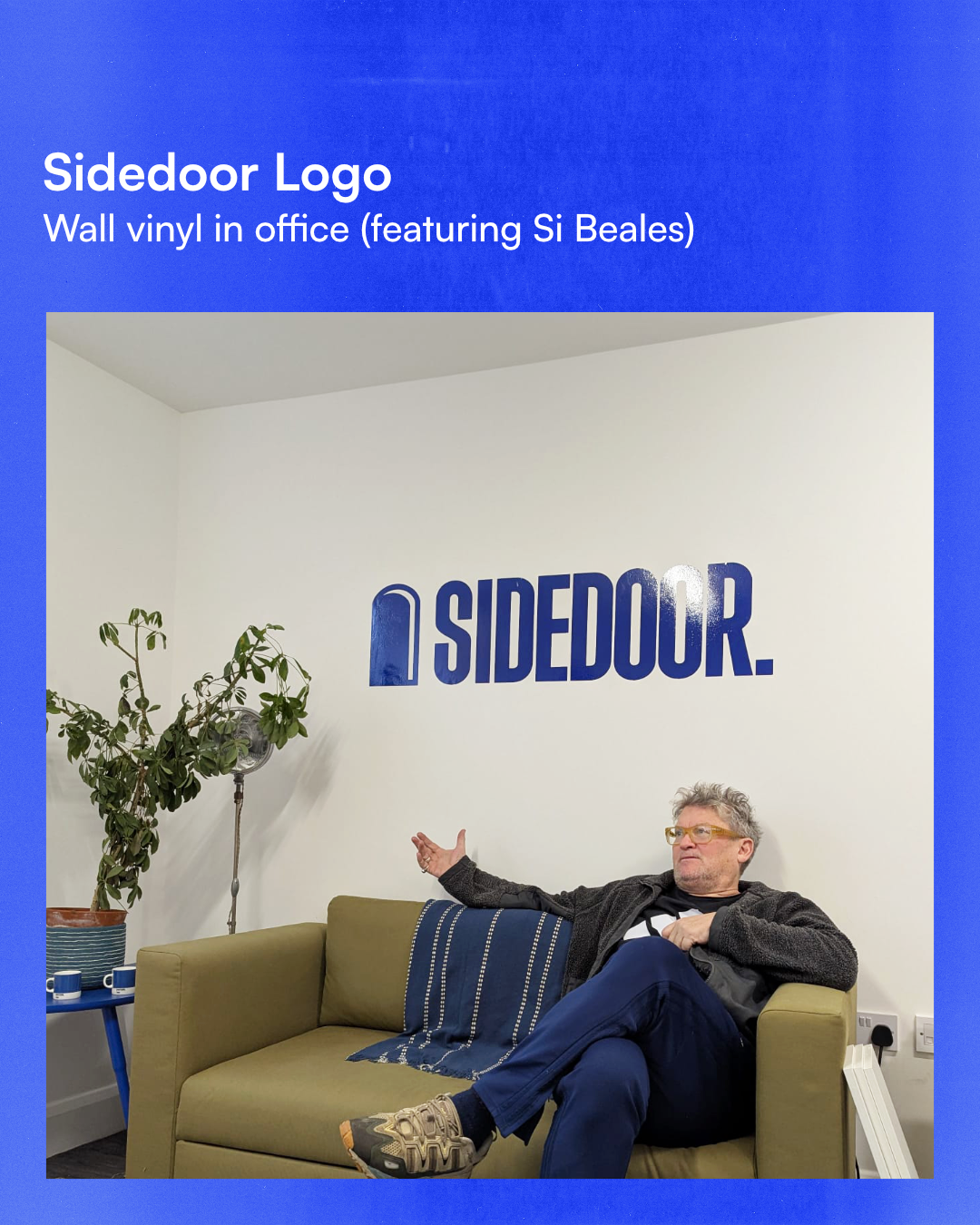
Nothing too polished. It’s about getting things wrong and learning from it.We also redesigned the logo mark and went back to the core idea, the side door.
Not the obvious route.
A more studied, less obvious way of doing things.
The new icon is:-super simple-therefore super flexible and easy to remixYou can open it, zoom through it, put things inside it. It’s not fixed to one look. That flexibility was really for the brand.If you haven’t already, go check out the website and let me know what you think!